

Introduction
Messy interfaces create slow decisions. When users see too many buttons, filters, settings, or menu choices at once, they often pause, click the wrong thing, or leave the page.
OptionDiv4 helps solve that problem by grouping digital options into four clear sections. It can be used in dashboards, product filters, app settings, onboarding flows, admin panels, and data-heavy interfaces.
The idea is simple: divide choices into logical blocks so users understand what to do next. For developers, it also creates cleaner code, easier updates, and more consistent layouts.
What Is OptionDiv4 in Modern UI Design?
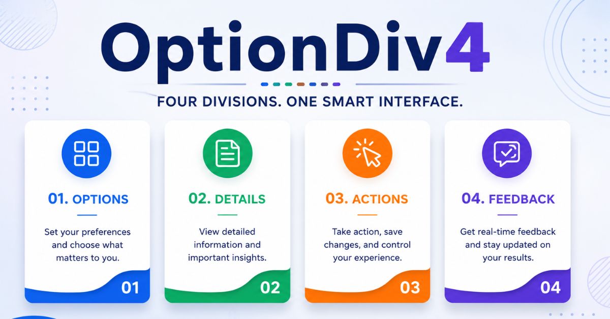
OptionDiv4 is a structured way to organize options, controls, or data into four clear divisions inside a digital interface. Each division has a specific purpose, such as navigation, user input, system feedback, or advanced settings.
It is not an official HTML tag, JavaScript library, or W3C standard. A better way to understand it is as a naming idea or design pattern for option grouping.
The “Div” part often reminds people of the HTML <div> element. MDN explains that a <div> is a generic container for flow content and has no effect until CSS or layout rules style it.
The value of OptionDiv4 comes from how you organize the content inside the structure. A poor four-box layout can still confuse users. A well-planned one can make complex choices feel simple.
A clean four-division structure usually helps with:
- Better visual grouping
- Faster scanning
- Easier mobile layouts
- More consistent design systems
- Cleaner frontend component planning
Think of a SaaS billing page. Instead of showing all billing choices in one long block, you could divide them into Plan, Usage, Payment, and Support. That simple grouping helps users know where to look first.
How OptionDiv4 Works Across UI, Data, and User Flow

A good four-part option layout starts with the user’s task. You do not divide the screen just because four boxes look neat. You divide it because each section helps the user make a better decision.
A practical OptionDiv4 setup may include:
| Division | Purpose | Example |
| Primary Options | Main choices users need first | Plan type, product size, account role |
| Supporting Details | Context that explains choices | Price, limits, descriptions |
| User Actions | Buttons or inputs for next steps | Save, compare, apply filter |
| System Feedback | Confirmation or status updates | Error message, success state, loading note |
This pattern works well when users need to compare related choices. Nielsen Norman Group has warned that too many choices can cause fatigue, dissatisfaction, or abandonment.
The four-division model also helps teams. Designers can map the user journey. Developers can build reusable components. Product managers can decide which choices deserve priority.
Here are common use cases:
- E-commerce filters: category, price, brand, availability
- Admin dashboards: users, permissions, reports, alerts
- App settings: profile, privacy, notifications, billing
- Learning platforms: lessons, progress, resources, certificates
- Analytics tools: traffic, conversions, segments, exports
The key is not the number four by itself. The key is reducing scattered choices into predictable groups.
How to Use OptionDiv4: A Simple Featured-Snippet Process
To use OptionDiv4, identify all user choices, group them into four logical sections, label each section clearly, test the layout on mobile and desktop, and measure whether users complete tasks faster with fewer errors.
Follow this process:
- List every option
Write down all buttons, fields, filters, toggles, and messages connected to the task. - Group related items
Put similar items together. Do not mix account settings with payment actions or error messages. - Name each division clearly
Use plain labels such as “Basic Settings,” “Advanced Options,” “Preview,” or “Save Changes.” - Choose the right layout
Use cards, tabs, accordions, columns, or panels based on screen size and content depth. - Test with real users
Watch where people hesitate. If they keep asking “Where do I click?” the grouping needs work.
| Checkpoint | Good Practice |
| Labels | Use clear section names and field labels |
| Accessibility | Support keyboard navigation and visible focus states |
| Mobile Layout | Stack sections cleanly on small screens |
| Speed | Avoid heavy scripts for simple option groups |
| Feedback | Show clear success, error, and loading messages |
W3C WCAG says labels or instructions should be provided when content requires user input, especially for controls such as checkboxes, radio buttons, and similar option sets.
Performance matters too. Google’s Core Web Vitals include real-world experience signals for loading, interactivity, and visual stability. If your option panels feel slow after clicks or taps, the interface may look organized but still frustrate users.
Common Mistakes
The biggest mistake is treating OptionDiv4 as decoration. Four boxes do not automatically create clarity. If each section contains random items, the design only looks organized from a distance.
Another mistake is overloading one division. For example, a “Settings” panel with 25 toggles is still confusing, even if the rest of the page has three clean cards.
Teams also forget accessibility. A clickable card should work with a keyboard, have readable labels, and show visible focus. W3C guidance says all functionality should be operable through a keyboard unless the action truly requires path-based movement.
Avoid these issues:
- Using vague labels like “More” or “Other”
- Hiding important choices inside advanced panels
- Making cards clickable without clear focus states
- Adding animations that slow down interaction
- Designing desktop first and fixing mobile later
A simple rule helps: if a user cannot explain the four sections after ten seconds, the structure needs improvement.
Pro Tips and Best Practices
OptionDiv4 works best when each division answers one user question. For example: What can I choose? What does it mean? What happens next? Did the system accept my action?
Use progressive disclosure when choices become complex. Show the most important options first, then reveal advanced controls only when users need them.
Keep visual weight balanced. If one section is critical, make it larger or place it first. If one section only provides status feedback, keep it smaller and quieter.
Use real labels from user language. “Payment Method” is clearer than “Transaction Configuration.” “Email Alerts” is clearer than “Communication Preferences Module.”
For frontend teams, keep the component flexible. A reusable four-section option component should allow different labels, states, validation messages, and responsive layouts.
For SEO and content-heavy sites, do not hide important content behind scripts that fail to render. Keep the structure lightweight, accessible, and readable.
FAQs
Is OptionDiv4 a real software tool?
OptionDiv4 is best understood as a UI organization concept, not a confirmed standalone software tool. It describes a way to divide options or interface elements into four manageable parts. Developers may use the name as a class, component, layout pattern, or internal naming convention.
Can OptionDiv4 improve user experience?
Yes, it can improve user experience when the four sections match real user needs. Clear grouping reduces confusion and helps people complete tasks faster. It works best for settings pages, dashboards, filters, comparison tools, and forms with multiple related choices.
When should you avoid a four-division layout?
Avoid a four-division layout when the task only needs one or two simple choices. Forcing four sections can create unnecessary complexity. Use it only when the content naturally separates into clear groups that help users scan, compare, or act.
How do you test whether an option layout works?
Test the layout by watching users complete real tasks without guidance. Track where they pause, misclick, or ask questions. You can also compare completion time, error rate, and form abandonment before and after changing the option structure.
Does this pattern matter for mobile design?
Yes, mobile design makes clear option grouping even more important. Small screens cannot show many controls comfortably at once. Stack sections logically, keep labels short, use large tap targets, and avoid hiding key actions too far below the fold.
Conclusion
OptionDiv4 is useful because it gives structure to digital choices. It helps designers reduce clutter, helps developers plan reusable components, and helps users understand what to do next without feeling overwhelmed.
The best approach is simple: group related options, label them clearly, support accessibility, keep performance light, and test the layout with real users. When used carefully, OptionDiv4 becomes more than a layout idea; it becomes a practical method for building cleaner, faster, and more user-friendly digital interfaces.